A logo evolution that breaks through
The original NRx logo was a simplified wordmark that due to coloring and character weight was lost in composition.
Conscious of the NRx legacy of boldly addressing life-threatening diseases that often go untreated, the mark was refined to make ensure the geometry created credibility, the characters felt bold and purposeful, and that the chevron ‘X’ became that moment of breakthrough for NRx. Strong, foundational, yet provocative and optimistic, the new mark signals NRx to transforming care for those facing the most dire of conditions.
Supporting Identity
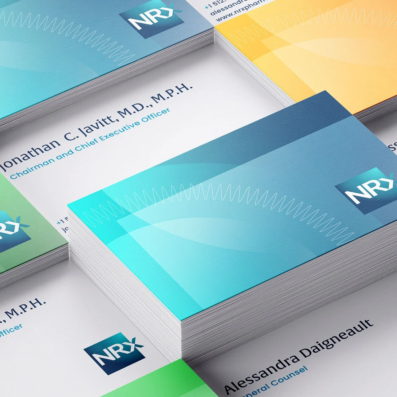
The supporting identity is a warm color palette that straddles the world of heath and technology. The simplified cellular graphics allow for a large use of the color while also subtle introducing the idea of science.
Core Elements
The core visual identity elements work together to create an expression that captures the optimism of NRx as it pursues breakthrough therapies for those at the most critical stages of disease.


